
如何自定义 AI Search 外观
有两种方式可以自定义你的 Shoply AI 搜索结果:
- 内置选项: 先从你的 Shoply AI 管理控制台中的控件开始,无需编写代码即可更改摘要、筛选器、按钮、颜色和产品布局。查看内置选项和预览。
- 自定义 CSS: 如果这些控件无法实现你想要的设计,可以使用 CSS——网页的样式语言——来微调字体、间距、边框和其他视觉细节。你也可以将它与内置设置结合使用。前往 CSS 指南。
你可能根本不需要 CSS
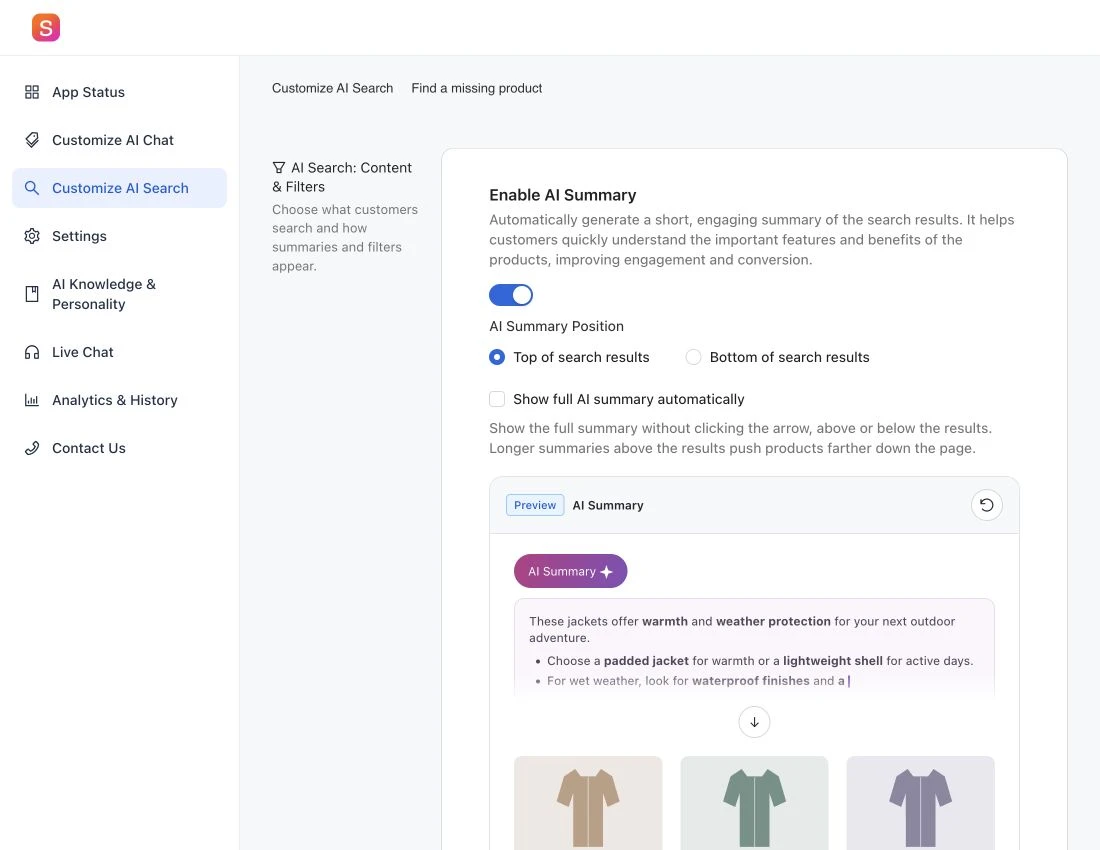
无论你使用 Shopify 还是其他网站平台,大多数搜索布局和外观更改都已经可以在你的 Shoply AI 管理控制台 中的 Customize AI Search 下完成。请先尝试这些内置选项,然后在管理后台中点击 Save 以应用你的选择。对于这些控件未涵盖的样式,再使用 CSS。
下面的交互式示例使用与管理后台相同的预览。它们是你可以在这里尝试的演示;不会更改你的商店。
- AI Summary: 打开或关闭摘要,并选择它显示在产品结果的上方还是下方。
- 搜索筛选器: 显示或隐藏筛选栏,并将筛选器放置在顶部、左侧或浮动面板中。左侧布局在较小屏幕上会移动到结果上方。有关对聊天结果的共享影响,请参阅搜索筛选器可见性设置。
- 产品操作按钮和颜色: 选择 Add to Cart、View Product 或 No Button。选择按钮的背景色和文字颜色,并更改评分星标的颜色以匹配你的商店。
- 每行产品数: 在桌面端选择三列或四列,在移动端选择一列或两列。列数越少,每个产品图片可用空间越大。
- 显示的产品总数: 为小屏幕手机、较大屏幕手机和桌面端分别设置产品数量。管理后台提供 3、4、6、8、9、12、15、16、18 或 20 个产品可选。此设置控制的是结果数量,而不是列数。
如果你仍然需要自定义设计,请继续阅读下面的 CSS 指南。
开始使用
如果内置选项无法提供你想要的外观,请使用自定义 CSS 来微调搜索结果。
Shoply AI Chat 和 AI Search 都可以显示搜索结果,因此你添加的 CSS 自定义选项会同时应用于两者。注意:AI Summary 功能仅在 Shoply AI Search 中可用。
首先,先启用 AI Search 再进行样式设置,这样你就可以在真实结果上预览更改。
在哪里添加 CSS
如果要隐藏整个筛选栏,请使用内置控件:前往 Customize AI Search → Search filters,关闭 Show filters in search results,然后点击 Save。无需使用 CSS。详情请参阅 Hide Search Filters 。
- 导航到 Shoply 应用管理控制台中的 Customize AI Search 部分。
- 找到 CSS styles for search elements 文本区域
- 在文本区域中输入你的自定义 CSS 代码
- 点击 Save 应用你的更改
CSS 基础
CSS 允许你更改颜色、字体、间距、边框等。基本语法是:
.class-name {
    property: value;
}
例如,要将文字颜色改为深红色:
.shoply-product-name {
    color:rgb(82, 2, 2);
}
理解 Shoply 专用的 CSS 类
Shoply 提供了特定的 CSS 类,你可以使用它们来定位搜索结果的不同部分。每个类都对应搜索结果中的一个特定元素。
Shoply 还为这些类定义了某些默认样式。你可以使用 Chrome DevTools 检查这些样式,并搜索每一个类。如果你需要覆盖默认样式,请按照 MDN CSS !important 文档 中的说明,在你的 CSS 规则中添加 !important 声明。
产品卡片类
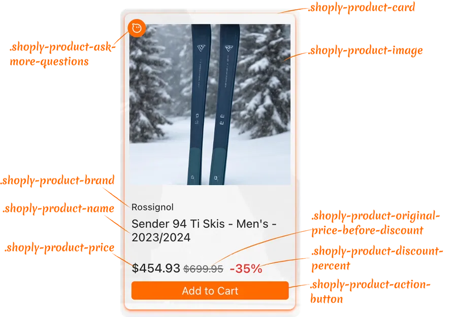
容器样式:
.shoply-product-image- 设置产品图片的样式.shoply-product-card- 设置产品卡片容器的样式
文本信息样式:
.shoply-product-brand- 设置显示在产品标题上方的产品品牌/供应商名称样式.shoply-product-name- 设置产品标题/名称的样式
价格样式:
.shoply-product-price- 设置产品价格样式(应用折扣后的价格).shoply-product-original-price-before-discount- 设置折扣前原价的样式(默认带删除线).shoply-product-discount-percent- 设置折扣百分比文字样式(默认显示为粗体红字)
操作按钮样式:
.shoply-product-action-button- 设置主要操作按钮的样式(Add to Cart、View Product 等).shoply-product-action-button-sold-out- 设置产品售罄时操作按钮的样式(禁用状态)
注意:在 Shoply 应用管理控制台的 Customize AI Search 部分中,你可以配置顾客点击操作按钮时会发生什么——他们可以将产品加入购物车、被重定向到产品页面,或者你也可以选择完全隐藏操作按钮。
AI Summary 类
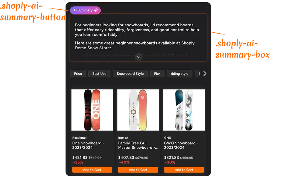
.shoply-ai-summary-box- 设置 AI 生成摘要的容器框样式。.shoply-ai-summary-button- 设置触发 AI 摘要生成的按钮样式。
使用 CSS 自定义搜索结果中的产品卡片示例
更改产品品牌样式
产品品牌显示在产品标题上方。以下是一些常见的自定义方式:
/* Make brand name smaller and gray */
.shoply-product-brand {
    font-size: 11px;
    color: #888888;
    font-weight: 500;
    text-transform: uppercase;
    letter-spacing: 0.5px;
}
自定义产品标题
产品名称是最重要的元素之一。可对其进行自定义以匹配你的品牌:
/* Make product title bold and larger */
.shoply-product-name {
    font-size: 18px;
    font-weight: 600;
    color: #1a1a1a;
    line-height: 1.4;
    margin-bottom: 8px;
}

/* Add hover effect */
.shoply-product-name:hover {
    color: #0066cc;
    text-decoration: underline;
}
产品价格样式示例
通过自定义样式让你的价格更加醒目:
/* Style the current price (after discount) */
.shoply-product-price {
    font-size: 20px;
    font-weight: 700;
    color: #e74c3c;
    margin-top: 10px;
}

/* Style the original price (before discount) - greyed out with strikethrough */
.shoply-product-original-price-before-discount {
    font-size: 14px;
    color: #999999;
    margin-left: 8px;
    text-decoration: line-through;
}
自定义操作按钮
你的操作按钮(Add to Cart、View Product)可以设置样式,以匹配你商店的设计:
/* Style the main action button with blue background, white text, rounded corners, and smooth transitions */
.shoply-product-action-button {
    background-color: #0066cc !important;
    color: #ffffff !important;
    border-radius: 6px;
    padding: 12px 24px;
    font-weight: 600;
    font-size: 14px;
    transition: all 0.3s ease;
    border: none;
}

/* Add hover effect - darker blue background, slight lift, and shadow */
.shoply-product-action-button:hover {
    background-color: #0052a3 !important;
    transform: translateY(-2px);
    box-shadow: 0 4px 8px rgba(0, 102, 204, 0.3);
}

/* Style sold-out button - grey background, darker grey text, disabled cursor, and reduced opacity */
.shoply-product-action-button-sold-out {
    background-color: #cccccc !important;
    color: #666666 !important;
    cursor: not-allowed;
    opacity: 0.6;
}
设置产品图片样式
使用边框、阴影或悬停效果来增强产品图片展示:
/* Add border and shadow to product images */
.shoply-product-image {
    border-radius: 8px;
    border: 2px solid #f0f0f0;
    box-shadow: 0 2px 8px rgba(0, 0, 0, 0.1);
    transition: all 0.3s ease;
}

/* Add hover effect of the product image*/
.shoply-product-image:hover {
    transform: scale(1.05);
    box-shadow: 0 4px 16px rgba(0, 0, 0, 0.2);
}
自定义 AI Summary 区域示例
对于启用了 AI Search 的商店,AI Summary 会出现在搜索结果顶部,并基于搜索结果即时解释该买什么以及为什么买——在顾客滚动浏览产品之前就能看到。
你可以在应用管理控制台的 Customize AI Search 页面中禁用 AI Summary。你也可以像下面所示那样使用 CSS 自定义它的外观。
设置 AI Summary 框样式
    /* Style the AI summary box with purple gradient background, white text, rounded corners, shadow, and semi-transparent border */
.shoply-ai-summary-box {
    background: linear-gradient(135deg, #667eea 0%, #764ba2 100%);
    color: #ffffff;
    padding: 24px;
    border-radius: 12px;
    box-shadow: 0 8px 24px rgba(102, 126, 234, 0.3);
    border: 1px solid rgba(255, 255, 255, 0.2);
}

/* Alternative: Light theme - light gray background with subtle border and shadow */
.shoply-ai-summary-box {
    background-color: #f8f9fa;
    border: 1px solid #e9ecef;
    padding: 20px;
    border-radius: 8px;
    box-shadow: 0 2px 8px rgba(0, 0, 0, 0.05);
}
自定义 AI Summary 按钮
默认情况下,AI Summary 会保持简短精炼,以节省屏幕空间。顾客可以点击“AI Summary Button”来展开并查看完整详情。想让它更符合你的品牌风格吗?你也可以自定义这个按钮!请查看下面的示例。
/* Customize the summary button */
.shoply-ai-summary-button {
    background: linear-gradient(135deg, #667eea 0%, #764ba2 100%) !important;
    color: #ffffff !important;
    border: none;
    border-radius: 20px;
    padding: 10px 20px;
    font-weight: 600;
    font-size: 14px;
    cursor: pointer;
    transition: all 0.3s ease;
}

/* Add hover effect */
.shoply-ai-summary-button:hover {
    transform: translateY(-2px);
    box-shadow: 0 4px 12px rgba(102, 126, 234, 0.4);
}
故障排除
我的 CSS 更改没有显示出来
- 检查是否有拼写错误:确保你的 CSS 类名拼写正确(它们都以
.shoply-开头) - 清除浏览器缓存:有时浏览器会缓存旧样式
- 检查 CSS 语法:确保你的所有 CSS 规则都已用
}正确闭合 - 使用
!important:如果样式没有生效,你可能需要添加!important来覆盖默认样式:css.shoply-product-action-button { background-color: #ff0000 !important; }
样式在移动端看起来不同
某些样式可能需要针对移动端进行专门调整。请使用媒体查询:
@media (max-width: 768px) {
    .shoply-product-name {
        font-size: 14px;
    }
}
需要重置为默认样式
只需清空 CSS 文本区域并保存。应用将恢复为默认样式。
需要更多帮助?
如果你在 CSS 自定义方面需要更多帮助:
- 查看应用设置中的可视化示例(Product Card Preview 和 AI Summary Preview)
- 参考 CSS 文档资源,例如 MDN Web Docs
- 通过 customer-obsession@shoplyai.ai 联系我们的支持团队,获取个性化帮助
祝你自定义愉快! 🎨
借助这些 CSS 类,你可以完全控制搜索结果的外观。大胆尝试、测试,并打造与你品牌完美匹配的搜索体验!