
How to Customize Your Search Results with CSS
Ready to make your search results look amazing? This guide will show you how to style your product search results and AI summary sections with CSS. No worries if you’re new to CSS—we’ve got you covered! And if you’re already comfortable with it, you’ll find plenty of tips to take your customization to the next level.
Getting Started
Both Shoply AI Chat and AI Search can display search results, so the CSS customization options you add will apply to both. Note: The AI Summary feature is only available in Shoply AI Search.
Where to Add Your CSS
- Navigate to the Customize AI Search section in Shoply app’s admin console.
- Find the CSS styles for search elements text area
- Enter your custom CSS code in the text area
- Click Save to apply your changes
CSS Basics
CSS allows you to change colors, fonts, spacing, borders, and more. The basic syntax is:
.class-name {
    property: value;
}
For example, to change the text color to dark red:
.shoply-product-name {
    color:rgb(82, 2, 2);
}
Understanding the Shoply-specific CSS Classes
Shoply provides specific CSS classes that you can use to target different parts of your search results. Each class corresponds to a specific element in the search result.
Shoply has also defined certain default styles for these classes. You can inspect those styles using Chrome DevTools and search for each of the class. If you need to override the default styles, add the !important declaration to your CSS rules as explained in the MDN CSS !important documentation .
Product Card Classes
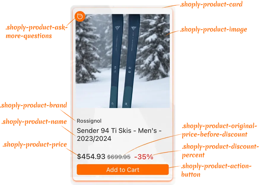
Styles for the container:
.shoply-product-image- Styles the product image.shoply-product-card- Styles the product card container
Styles for the text information:
.shoply-product-brand- Styles the product brand/vendor name displayed above the product title.shoply-product-name- Styles the product title/name
Styles for price:
.shoply-product-price- Styles the product price (after the discount is applied).shoply-product-original-price-before-discount- Styles the original price before discount (with line-through decoration by defaut).shoply-product-discount-percent- Styles the discount percentage text (displayed as bold red text by default)
Styles for the action button:
.shoply-product-action-button- Styles the main action buttons (Add to Cart, View Product, etc.).shoply-product-action-button-sold-out- Styles the action button when product is sold out (disabled state)
Note: In the Customize AI Search section of the Shoply app’s admin console, you can configure what happens when customers click the action button—they can add the product to cart, be redirected to the product page, or you can choose to hide the action button entirely.
AI Summary Classes
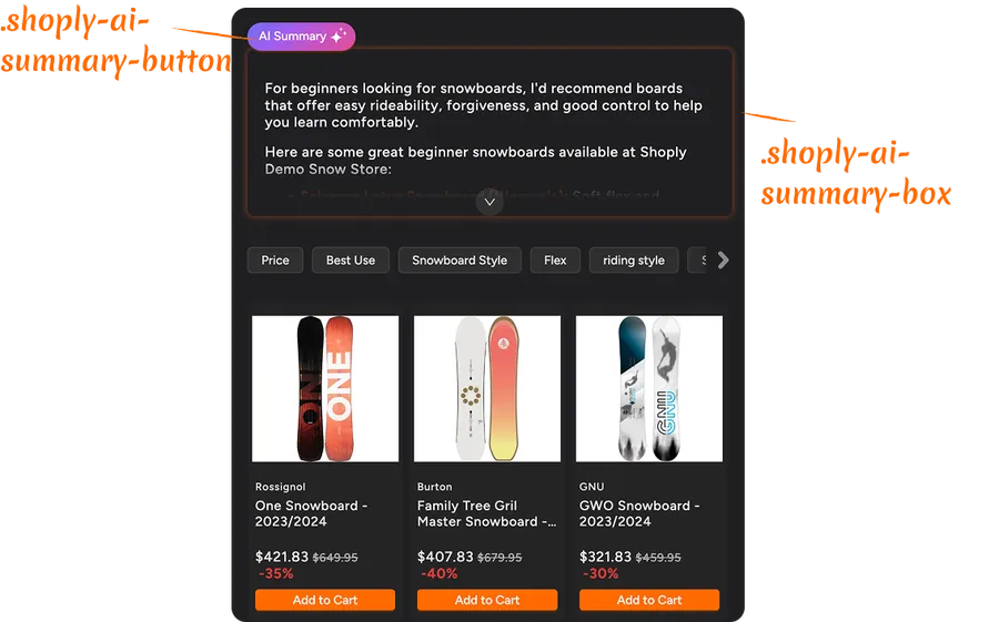
.shoply-ai-summary-box- Styles the container box for AI-generated summaries..shoply-ai-summary-button- Styles the button that triggers AI summary generation.
Examples for Customizing Product Cards in Search Results with CSS
Changing Product Brand Styling
The product brand appears above the product title. Here are some common customizations:
/* Make brand name smaller and gray */
.shoply-product-brand {
    font-size: 11px;
    color: #888888;
    font-weight: 500;
    text-transform: uppercase;
    letter-spacing: 0.5px;
}
Customizing Product Title
The product name is one of the most important elements. Customize it to match your brand:
/* Make product title bold and larger */
.shoply-product-name {
    font-size: 18px;
    font-weight: 600;
    color: #1a1a1a;
    line-height: 1.4;
    margin-bottom: 8px;
}

/* Add hover effect */
.shoply-product-name:hover {
    color: #0066cc;
    text-decoration: underline;
}
Examples for Styling Product Prices
Make your prices stand out with custom styling:
/* Style the current price (after discount) */
.shoply-product-price {
    font-size: 20px;
    font-weight: 700;
    color: #e74c3c;
    margin-top: 10px;
}

/* Style the original price (before discount) - greyed out with strikethrough */
.shoply-product-original-price-before-discount {
    font-size: 14px;
    color: #999999;
    margin-left: 8px;
    text-decoration: line-through;
}
Customizing Action Buttons
Your action buttons (Add to Cart, View Product) can be styled to match your store’s design:
/* Style the main action button with blue background, white text, rounded corners, and smooth transitions */
.shoply-product-action-button {
    background-color: #0066cc !important;
    color: #ffffff !important;
    border-radius: 6px;
    padding: 12px 24px;
    font-weight: 600;
    font-size: 14px;
    transition: all 0.3s ease;
    border: none;
}

/* Add hover effect - darker blue background, slight lift, and shadow */
.shoply-product-action-button:hover {
    background-color: #0052a3 !important;
    transform: translateY(-2px);
    box-shadow: 0 4px 8px rgba(0, 102, 204, 0.3);
}

/* Style sold-out button - grey background, darker grey text, disabled cursor, and reduced opacity */
.shoply-product-action-button-sold-out {
    background-color: #cccccc !important;
    color: #666666 !important;
    cursor: not-allowed;
    opacity: 0.6;
}
Styling Product Images
Enhance your product images with borders, shadows, or hover effects:
/* Add border and shadow to product images */
.shoply-product-image {
    border-radius: 8px;
    border: 2px solid #f0f0f0;
    box-shadow: 0 2px 8px rgba(0, 0, 0, 0.1);
    transition: all 0.3s ease;
}

/* Add hover effect of the product image*/
.shoply-product-image:hover {
    transform: scale(1.05);
    box-shadow: 0 4px 16px rgba(0, 0, 0, 0.2);
}
Examples for Customizing AI Summary Section
For stores that enable the AI Search, AI Summary will appear at the top of search results and instantly explains what to buy and why based on the search results — before customers even scroll through products.
You can disable the AI Summary in the Customize AI Search page in the app’s admin console. You can also customize its appearance using CSS as shown below.
Styling the AI Summary Box
    /* Style the AI summary box with purple gradient background, white text, rounded corners, shadow, and semi-transparent border */
.shoply-ai-summary-box {
    background: linear-gradient(135deg, #667eea 0%, #764ba2 100%);
    color: #ffffff;
    padding: 24px;
    border-radius: 12px;
    box-shadow: 0 8px 24px rgba(102, 126, 234, 0.3);
    border: 1px solid rgba(255, 255, 255, 0.2);
}

/* Alternative: Light theme - light gray background with subtle border and shadow */
.shoply-ai-summary-box {
    background-color: #f8f9fa;
    border: 1px solid #e9ecef;
    padding: 20px;
    border-radius: 8px;
    box-shadow: 0 2px 8px rgba(0, 0, 0, 0.05);
}
Customizing the AI Summary Button
By default, AI Summary is kept short and sweet to save screen space. Customers can click the “AI Summary Button” to expand and see the full details. Want to make it match your brand? You can customize this button too! Check out the examples below.
/* Customize the summary button */
.shoply-ai-summary-button {
    background: linear-gradient(135deg, #667eea 0%, #764ba2 100%) !important;
    color: #ffffff !important;
    border: none;
    border-radius: 20px;
    padding: 10px 20px;
    font-weight: 600;
    font-size: 14px;
    cursor: pointer;
    transition: all 0.3s ease;
}

/* Add hover effect */
.shoply-ai-summary-button:hover {
    transform: translateY(-2px);
    box-shadow: 0 4px 12px rgba(102, 126, 234, 0.4);
}
Troubleshooting
My CSS changes aren’t showing up
- Check for typos: Make sure your CSS class names are spelled correctly (they start with
.shoply-) - Clear your browser cache: Sometimes browsers cache old styles
- Check CSS syntax: Make sure all your CSS rules are properly closed with
} - Use
!important: If styles aren’t applying, you may need to add!importantto override default styles:.shoply-product-action-button { background-color: #ff0000 !important; }
Styles look different on mobile
Some styles may need mobile-specific adjustments. Use media queries:
@media (max-width: 768px) {
    .shoply-product-name {
        font-size: 14px;
    }
}
Need to reset to default styles
Simply clear the CSS text area and save. The app will revert to default styling.
Need More Help?
If you need additional assistance with CSS customization:
- Check the visual examples in the app settings (Product Card Preview and AI Summary Preview)
- Refer to CSS documentation resources like MDN Web Docs
- Contact our support team for personalized help at customer-obsession@shoplyai.ai
Happy Customizing! 🎨
With these CSS classes, you have full control over the appearance of your search results. Experiment, test, and create a search experience that perfectly matches your brand!